
.png)
Great catalog page design reduces the effort it takes a buyer to find, compare, and trust a product.
The elements that move conversion most are a clear visual hierarchy (grid before filters, filters before noise), consistent large-format product photography, CTAs placed where confidence peaks rather than where space is left over, deliberate white space that separates decision units, a type system with enough contrast to scan prices and specs in under a second, and a mobile layout that never makes a buyer choose between seeing the product and seeing the filter panel.
Below, each of these is broken down with the research behind it, what it looks like in practice, and how teams building catalogs at scale (50, 500, or 50,000 SKUs) actually implement it.
A product catalog page is not a navigation layer sitting between the homepage and checkout. It is a filtering mechanism for buyer intent, and every design decision on it either shortens or lengthens the distance between "I'm browsing" and "I'm confident enough to act."
The performance data on this is unusually consistent across industries. Retailers that fixed load speed and layout stability on category pages saw double-digit swings in conversion, cart engagement, and bounce rate, in some cases with no other change to the page. Retailers that fixed filtering, product card density, and imagery saw similar gains without touching backend performance at all.
The two levers (speed and clarity) compound. A fast page with a confusing layout still loses buyers, and a beautifully organized page that loads slowly never gets seen.
For B2B catalogs specifically, where a single page might represent a $50,000 wholesale order or a distributor deciding whether to keep working with you next quarter, the stakes are higher and the tolerance for friction is lower. A buyer comparing 40 SKUs across three suppliers will not tolerate a catalog that makes them open ten tabs to check specs. They will simply move to the supplier whose catalog respects their time.
That is the lens for everything below: catalog page design is the mechanism that turns "I have a lot of products" into "a buyer can act on the right one, fast."
Before getting into individual elements, it helps to anchor on what the page is actually for. Research on product listing behavior converges on the same five questions a buyer is unconsciously asking as they scan:
Visual hierarchy, photography, CTA placement, white space, typography, and mobile responsiveness are not six separate design tasks. They are six different tools for answering those same five questions faster.
Visual hierarchy is the sequence in which a buyer's eye finds information on the page, and on a catalog page, that sequence should mirror the buying decision itself, not the org chart of who supplied which asset.
What good hierarchy looks like on a catalog page:
Where teams get this wrong: overloading the top of the page with hero banners, seasonal promotions, or brand storytelling that pushes the actual product grid below the fold. A catalog page is not a landing page. Every pixel above the grid is a pixel a buyer has to scroll past before they can do the thing they came to do.
This is exactly why our catalog templates default to a hierarchy of cover or context page, then straight into product-first layouts, rather than forcing brand storytelling and product discovery onto the same page.
Clients building large catalogs, like one importer managing 1,800 to 2,000 SKUs across wholesale and retail channels, use this to keep taxonomy and hierarchy consistent even as their product count grows, because the layout logic doesn't have to be rebuilt every time the SKU count changes.
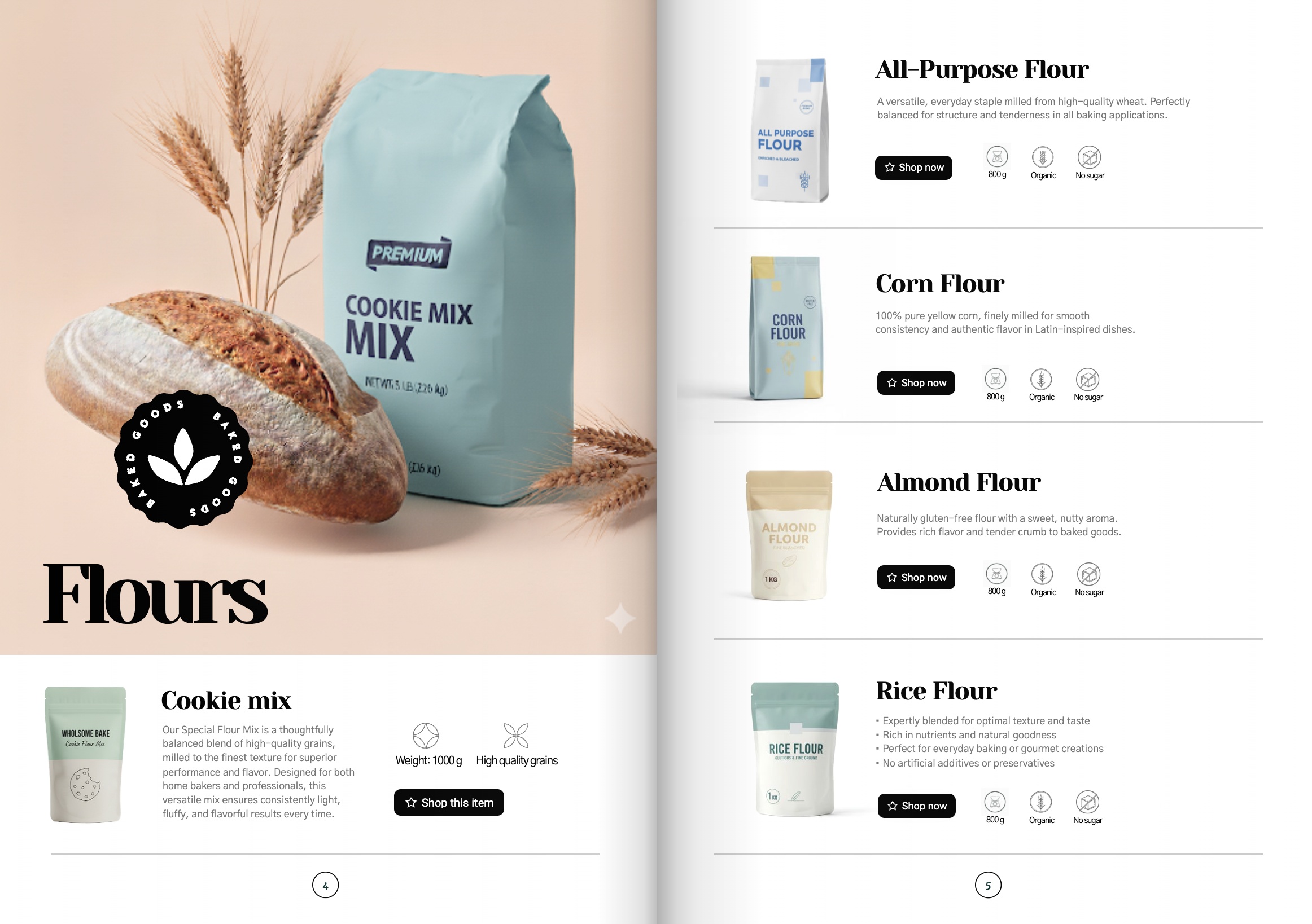
In visually driven categories (apparel, furniture, beauty, decor, food and beverage), imagery is often the primary input buyers use to compare products, more than the description text next to it.
The research consensus is specific: catalog imagery should be large, consistent, specific, dynamic where useful, and inclusive of the actual variant being shown. A few practical rules follow from that:
For B2B and wholesale catalogs, photography carries even more weight because there's often no in-person sample to fall back on. A catalog with inconsistent or low-resolution product images signals to a distributor or retail buyer that the supplier relationship itself might be inconsistent. This is a recurring theme surfaced directly from prospect conversations: teams stuck with static, template-locked catalog generators frequently cite "bland," inconsistent visual presentation as a reason buyers don't trust the catalog enough to act on it without a follow-up call.
But we saw on your clients' that static photography has a ceiling. Even a perfectly consistent, well-lit product shot can only communicate so much about scale, texture, or how a product actually behaves in context.
This is why Catalogy builds in AI-powered living visuals: a single product image can be animated to bring it to life on the page, giving buyers a better sense of context and detail than a flat photo alone. In practice, this shows up directly in the metrics that matter most for catalog pages: buyers spend more time on a page with a living visual than a static one, because there's more to look at and it reads as more credible.
The most common CTA mistake on catalog pages isn't the button copy. It's the location. A "View Details" or "Add to Cart" button placed where the eye lands after the buyer has already decided converts. The same button placed as an afterthought below three unrelated blocks of text does not, even with identical wording.
Principles that hold up across categories:
Where this shows up in practice: catalogs built for wholesale and distributor relationships increasingly use a "shop this item" or wishlist flow rather than a hard checkout button, because the actual close still happens through a sales rep. The CTA's job in that context isn't to complete a transaction. It's to capture unambiguous buying intent (this specific SKU, this specific variant, this specific buyer) and hand it to a human at exactly the right moment.
Catalogy's wishlist flow is built around exactly this handoff: a buyer selects the variant they want directly on the catalog page, submits it, and the sales team receives that request with the SKU, variant, and buyer already attached, ready to pick up the conversation instead of starting it from scratch.
White space is the most underrated lever in catalog page design because it doesn't look like a "feature." But every unit of breathing room around a product card is doing real cognitive work: it tells the eye where one decision unit ends, and the next begins.
How to use it deliberately:
For B2B catalogs specifically, teams managing large-page-count catalogs (some running 300+ pages for enterprise clients) find that generous spacing per product actually reduces total design and revision cycles, because a card with room to breathe doesn't need to be redesigned every time a new spec or badge gets added to the data feed. It absorbs change gracefully instead of requiring a rebuild.
Typography on a catalog page has one job: let a buyer distinguish a product name from a price from a spec from a badge, at a glance, without reading carefully. That's a contrast and hierarchy problem, not a font-choice problem.
What works:
Mobile is not a smaller version of the desktop catalog page. It's a different set of constraints, and the two most common mistakes are treating filters as an afterthought and letting product cards lose the information density that makes them useful.
What a responsive catalog page needs to do well:
For distributors and B2B sellers whose buyers are often checking a catalog from a warehouse floor, a trade show, or between meetings, mobile responsiveness isn't a nice-to-have. It's frequently the primary way the catalog is used, and a desktop-only mental model of "the catalog" misses most of its actual usage.
But we know from our clients that responsiveness can't stop at the browser.
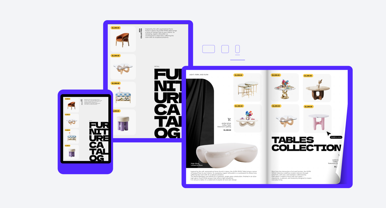
Every catalog built on Catalogy renders correctly on any device by default, desktop, tablet, or phone, without a separate mobile template to maintain. And because trade show floors and warehouse aisles don't always have reliable signal, catalogs stay fully viewable offline, so a buyer checking specs mid-conversation isn't stuck waiting on a connection to see the price.
Great catalog design doesn't stop after publishing. Catalogy includes built-in analytics that show how readers engage with your catalogs, helping you improve layouts based on real behavior instead of guesswork.
Track key metrics like views, time spent, page-level performance, product interactions, traffic sources, and reader devices to understand what's working. Use heatmaps to see where readers click and AI-powered insights to identify opportunities for improvement.
By measuring engagement and testing changes over time, Catalogy helps you continuously optimize your catalog pages for a better user experience and higher conversions.
Every principle above is easy to state and hard to maintain past a few dozen SKUs, or once pricing and stock start changing weekly. Tools built for one-off layouts (InDesign, static Data Merge templates) do a great job on a single, hand-art-directed page where the data never moves, but every element above has to be manually rebuilt each time the product data changes.
That breaks down fast at real scale: thousands of SKUs, frequent price changes, and layout logic that has to hold up on a tablet, a phone, and in print. Catalogy is built for that. Product feeds populate templates that already encode the hierarchy above, so a price change updates the live catalog instantly, no rebuild. Clients running 300+ page catalogs and 1,800+ SKU wholesale programs use this to keep the UX consistent at a scale manual design can't match.
If your catalog shows any of these patterns, book a demo and bring your product feed. We'll show you it rebuilt with this structure, live.
Product card clarity is the foundation of great catalog design. Every product card should use consistent imagery, display the price prominently, show the average rating and review count, and include a clear call to action. If you're building your catalog with Catalogy, use reusable product card layouts to keep every page consistent. Since buyers scan dozens of products in a single session, even small improvements to product cards can significantly increase engagement and conversions.
There's no universal number, it depends on the complexity of your products. Technical B2B catalogs often work best with 4–6 products per page or view, while simpler consumer products can use denser grids. With Catalogy, you can quickly test different layouts and adjust product density without redesigning your entire catalog.
Use Add to Cart for straightforward, low-consideration purchases where buyers already know what they need. For products with multiple variants, pricing tiers, or technical specifications, View Details, Request a Quote, or Add to Wishlist are usually better choices. Catalogy supports interactive shopping experiences, so you can choose the CTA that best fits your customers' buying journey.
The core UX principles remain the same: clear visual hierarchy, easy scanning, transparent pricing, and mobile-friendly layouts. The biggest differences are the buying actions and business requirements. B2B catalogs often replace checkout with quote requests or wishlists, and Catalogy lets you publish both interactive digital catalogs and print-ready PDFs from the same product data.
Well-structured catalog pages are easier for both search engines and AI answer engines to understand. Clean HTML, descriptive product information, proper category organization, and fast-loading pages improve discoverability. Catalogy generates SEO-friendly digital catalogs with crawlable product pages, helping your products become more visible in both traditional search results and AI-powered search experiences.
Start with your product cards. Standardize product images, make prices easier to scan, and replace vague buttons with clear CTAs. These updates improve every product on the page without requiring a full redesign. If you're using Catalogy, you can apply these changes across your entire catalog in minutes by updating your template instead of editing each page individually.
.png)